East TN Hive & Honey
2023
Branding, logo design, 2D
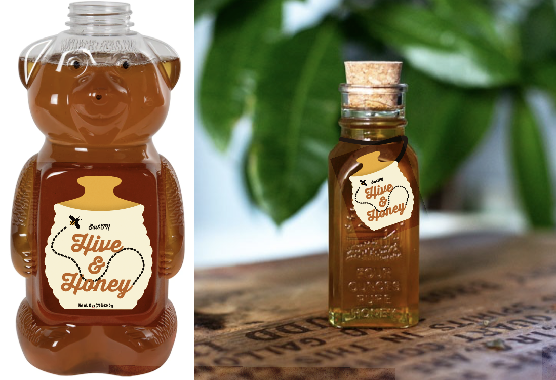
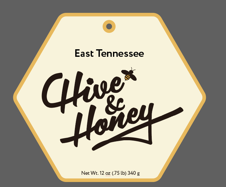
While interning at Robin Easter Design, I had the opportunity to propose a logo for East Tennessee Hive & Honey. The shape hints at the clovers and flowers that bees pollinate in East Tennessee. The typography is retro and inviting, echoing the feel of their glass and bear bottles.
Visual Research
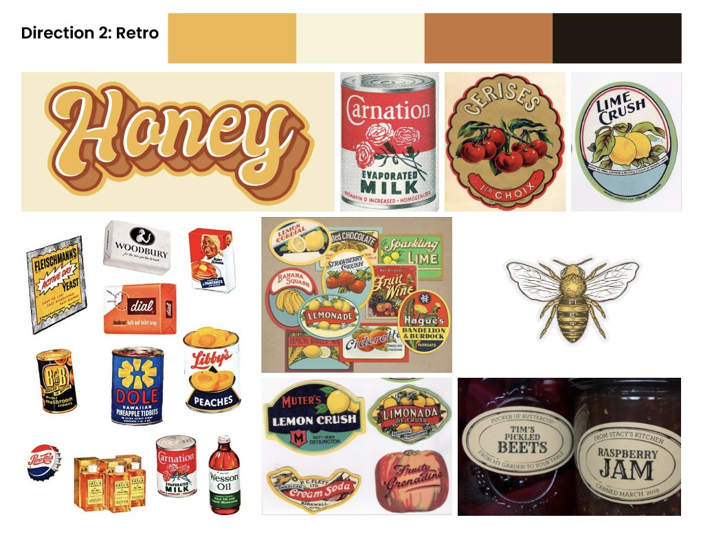
Before putting pen to paper, I did visual research on shapes, colors, and objects related to bees and honey, as well as illustration styles. This research resulted in three moodboards.

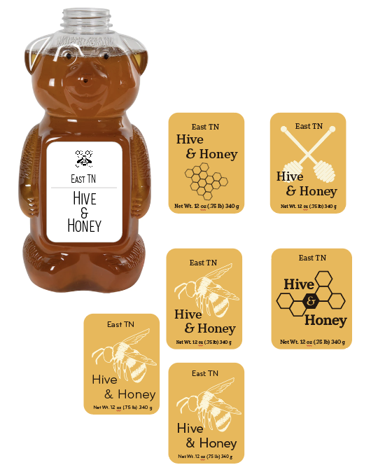
Initial Ideas

Proposed Design
The proposed design features a clover shape that references clover flowers that bees in East Tennessee pollinate. I customized the typeface to have large curves that echo the clover shape and create movement. They also look like a bee trail. I used warm, natural colors that emphasize the fact that the honey is homemade locally.


After conducting research, I began exploring the two different directions. I ultimately decided to explore the retro direction more, as that style is prevalent in the stores the honey would be sold in, and is more in line with the nostalgic honey bear and glass bottles.