NPN Logo
2023
Branding, logo design, 2D
While interning at Robin Easter Design, I designed and proposed a logo for the National Partnership Network, whose mission is to make information about pregnancies with disabilities as well as birth defects due to substance abuse more accessible.
Visual Research
There was little information available on the organization beyond their mission. Knowing that NPN was centered around the topics of pregnancy and disability, I began researching what visuals already exist related to these topics. I collected imagery that successful as well as imagery that was unsuccessful and should be avoided. I also looked into visuals and ideas that I could draw inspiration from to create something new, whether it be related to colors or shapes.

Initial Ideas
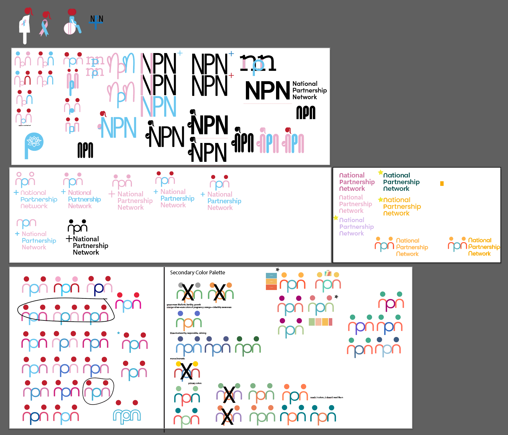
Final Logo & Additional Assets
Once I settled on a design that was abstract enough to hint at a pregnant form but not explicitly show it, the process became all about the color palette. It was decided that the pink and blue was too feminine, and felt more like a baby-related brand as opposed to a scientific brand. I did more research, and chose colors that are warm, bright, and exciting, yet still professional. Orange is representative of infertility awareness, and blue traditionally represents trust, intelligence, and reliability.
The primary typeface for the NPN brand is Poppins. It was chosen because it is soft and welcoming, yet professional; it can be used for large and small chunks of text; its more structured nature provides contrast to the roundness of the logo itself; and it has variable weights for different needs. The logo was created using All Round Gothic.
Within the logo, there are some key moments I’d like to highlight. The curved shape of the “n” with the added dot above embodies the human aspect of NPN. The abstract nature of the “person” it creates is inclusive of all gender identities. Additionally, the moments of overlap and contact signify bridging the gap between science and everyday understanding, creating a community and partnership.
To support the logo and branding, I created additional assets that the brand can use. The first is this light blue design. The shape is similar to that of cells, and when connected, it creates a network. In the orange asset, the curves are reminiscent of the logo mark. The added dots tie in the human element of the brand, and spacing them out further emphasizes the idea of a network connecting people together. The height variation is similar to that of a heartbeat monitor, again touching on that human aspect of NPN. It can also be outlined, a nod to the two pink lines of a positive pregnancy test. Examples of all of these pieces in use are below.


Initially, I wanted to use the colors pink, blue, and red, as pink and blue represents birth defect awareness and red represents substance abuse awareness. I wanted to incorporate some of the iconography that I’d found in my research, but it was too “on the nose,” so I leaned into using the NPN abbreviation. I spent time trying to hand-draw a logo where the letters would connect and flow into one another, but after hours of doing so I realized it would be more successful to use an existing typeface and modify it as necessary.
To give some insight into the inner workings of my brain during this process, I’ve included a screenshot of my Illustrator boards, as well as pages of my sketchbook.


